QUESTION 2 -HOW DOES YOUR MEDIA PRODUCT REPRESENT PARTICULAR SOCIAL GROUPS
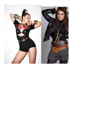
I believe these two images are very similar as the pose is almost exact, the body language shown represents attitude and fierceness in both images, the reason i chose to use this images is because i believed it went well with the heading of my dps, ‘the devil and her demons’ because my model posed with confidence and attitude, it definitely showed on the camera, i think that my image shows independence as well as glamour as the model is very attractive and also successful. This would entice young adults to buy it. Although the two images are very similar, there are slight differences, as my model is looking straight at the camera, as if she was looking at the reader, this makes the magazine more personal to the reader, where as the model looking away is slightly disconnected from the audience/reader, the social trend for my magazine would be teenagers and young adults as i think it gives off a fun yet to the point impression. The costumes of both models are slightly different as my model is more covered up however the two photos still show a individual dress sense which looks ‘cool’ to the reader.
My dps model is also the model of my front cover, this was to create a theme through my magazine making it appear more professional. The model I used I believe is definitely role model material for the younger readers of my magazine, this is because she is glamorous and independent even though she is only young, this would encourage young readers to aspire to be like her.
My model also goes well with the storyline she is representing, this Connotates that she has put her regretful past behind her and also encourages other girls to do the same and to emphasise her progress.


 I think ‘Q’ magazine is very different from my own as it has a different layout however the image on the front cover is very similar as my image shot type is very much the same,the highlighting device on the bottom right is also another similarity. This magazine features different genres of music however is very successful and popular, the publisher of ‘Q’ is Bauer media group. Which is a very successful company which publishes a number of different magazines such as take a break and TV choice. Take a break is aimed at a much older target audience than ‘Q’ featuring real life stories and diet tips, this attracts a older lady compared to a young lady in her 20’s as it is more adult orientated and real life, where as ‘Q’ is more about the type of latest music to listen to and the hottest singers and artists hitting the music industry. ‘Q’ magazine aims at a young audience just as I intend mine to do, the publisher is a very large company with a large variety of different magazines and target audiences therefore i believe my own magazine would fit in with the music magazines of today, however in my opinion i think the look and style of my magazine is slightly different to most on the shelves but i believe that it is an advantage as it will catch the readers eye and make them more intrigued to see why it is so different from the average music magazine, i believe ‘Q’ magazine demonstrates this well.


